Player COMMUNITY BANNED  Offline
ljUSTiNl has written
Guest has written
Insane map jUsTiN ! Maybe you are planning to release more remakes of ur amazing maps? like this high quality version of de_bridge. Will there be new player models/skins? It would give the game a new look.
Something many people are waiting for..
This new de_bridge will most likely be my final map. I do plan to update some of my best maps, not as high-quality as this newest one, but just fix some bugs, improve a few textures, remove lasers & secrets, and basically make them "online-ready".
Maps of mine I plan to update for MAX:
-cs_druglab_2007
-de_prodigy_JW
-dm_theforest
-csde_airport
-as_prisoner_camp
-de_bankjob (1&2 - not for sure)
But I don't plan on making any player or weapon skins.
I look forward to it.
I can imagine the pain you've got working so hard on some of your map that it isn't even funny anymore.
Thumbs up for you man! Player has written
ljUSTiNl has written
Guest has written
Insane map jUsTiN ! Maybe you are planning to release more remakes of ur amazing maps? like this high quality version of de_bridge. Will there be new player models/skins? It would give the game a new look.
Something many people are waiting for..
This new de_bridge will most likely be my final map. I do plan to update some of my best maps, not as high-quality as this newest one, but just fix some bugs, improve a few textures, remove lasers & secrets, and basically make them "online-ready".
Maps of mine I plan to update for MAX:
-cs_druglab_2007
-de_prodigy_JW
-dm_theforest
-csde_airport
-as_prisoner_camp
-de_bankjob (1&2 - not for sure)
But I don't plan on making any player or weapon skins.
I look forward to it.
I can imagine the pain you've got working so hard on some of your map that it isn't even funny anymore.
Thumbs up for you man!
de_bridge is a good map to fix  would it be possible to make some of those maps with the same "high" quality ? just a question. Did u make that background sprite by yourself?
 Guest has written
would it be possible to make some of those maps with the same "high" quality ? just a question. Did u make that background sprite by yourself?
Because every single other map ever made by me or anyone else for CS2D has been designed by using individual tiles to make the map, now that I am making this one final de_bridge map where the map is instead made of one large high-quality image painted detail by detail, there would be no way for me to be able to take any previous maps and convert them to the same "style" of mapping. As I said in my last post, with a select few of my maps I plan to update textures and fix bugs, but no more than that.
In my map de_TheBridge, the map-image was painted entirely by myself, using textures from various sources, and is very far from finished. All I have completed so far, as you may be able to tell from the screenshot, is most of the walls and floors. Various obstacles, objects, items, and most of the fine details are still yet to be added. DC?!
maybe you can add to the options "mouse speed" maybe some pplayers prefer anther speed then the others  Wow the rpg-launcher vid is pretty cool. But i guess the recoil should be much stronger!? Btw why is the text color now yellow ? the current one is the right i think.
Also u should add the weapon sign, for example it should be like : Player "x" Player2 not Player USP Player2. "x" has to be the weapon sign like in cs1.6
Maybe its not important but it would be more cs1.6 like. I think there should be a map editor released with CS2D max. DC released some map editors back in 2004-2005, but seperate perhaps that's good or bad I don't know.
Anyways I think CS2D max should have some powerful new entities for mapping purposes. 
DC Admin  Offline
cs2d max has its on map editor integrated like the current cs2d. and yes I'm thinking about new cool entity stuff but I don't want to talk about it 
furthermore rpgs do not have much recoil. sounds strange but its the truth  I also noticed the weapon shadows is kinda plain. It's just a round dot that blends in transparency. It would be cool if it was shaped after the gun and has same transparent effect as you have on that dot. If that's even possible.
It's possible to make text glow using HTML and the glow is shaped after the text. Is it possible to do the same in MAX? perhaps a very low glow would be good, like this. I edited this in GIMP, I doubt it will be the same if used in MAX but anyway here is a example.


edited 3×, last 04.07.08 10:44:28 pm
aight, and what do u think about the second suggestion suggestion.. mrc User  Offline
hiuaheiauheiuaehie RPG LAUNCHER! LOL!
there are some things to fix, like:
counter-terrorists to Counter-Terrorists...
etc, etc... thats not a big deal... 
silencer, Silencer..etc..etc..ehaeuahue 
I love the player movement, walking...awesome! DC Admin  Offline
KimKat: There already is such an shadow in addition to the round shadow. however its soo damn small (1 pixel) that it is hard to see it (and nearly impossible to see it in the videos). Maybe I should increase the offset so that the shadow looks bigger. DC has written
KimKat: There already is such an shadow in addition to the round shadow. however its soo damn small (1 pixel) that it is hard to see it (and nearly impossible to see it in the videos). Maybe I should increase the offset so that the shadow looks bigger.
I don't think you should offset it any more, because otherwise it will unrealistically appear as if the gun is floating above the ground. I see that there already is a solid 1px weapon shadow, but I think what KimKat is suggesting is to have a soft shadow.

This is a similar example to what KimKat just recently posted, but I tried to make it a bit clearer. I just used a random shape and some random textures to show more of what a gun laying on the ground might look like. DC Admin  Offline
I know. However this would either cost more speed or increase the time for loading a bit. I'll think about an option for soft shadows. Player COMMUNITY BANNED  Offline
The RPG video was pretty nice.
I'm not a weapon expert but I sure know that the RPG Launcher has a brown color somewhere, maybe you could add that brown color and make the RPG Launcher more realistic.
Here is a screenshot of what I mean, notice the ''Wooden Heat Shield'':
http://static.howstuffworks.com/gif/rpg-7-launcher.gif DC has written
I know. However this would either cost more speed or increase the time for loading a bit. I'll think about an option for soft shadows.
KimKat has written
DC has written
I know. However this would either cost more speed or increase the time for loading a bit. I'll think about an option for soft shadows.
Yeah add that, also maybe a switch to turn the shadows on/off too. So people can save some CPU if they have really slow computers or something.
Shadow Quality: None; Low; High
Low being hard shadows, High being soft shadows.
Just a suggestion if you have the time to code it into the game. But I'm sure you have more important features to implement rather than a simple aesthetic.
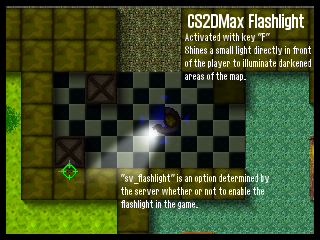
Edit: I've come up with a few more suggestions for CS2D Max. Please realize that while these sound very definite, I realize that you are the one in control of developing the game, so please take these as they are: simple suggestions.
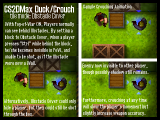
I've made these two small images describing some suggestions:


To go along with the current Obstacle and Obstacle Block tile settings, this Obstacle Cover would have to be set specifically for certain tiles. But I think regardless of whether you change the tile settings, including a Crouch option would make the game more tactical and improve gameplay because players could learn to deal with slow movement in trade off for better accuracy, as in the real Counter Strike.
Furthermore, as I know you have started working on Fog-of-War, but still need to improve it, I suggest creating an option for the opacity of the FoW. I've always thought that FoW is great for the gameplay, but darkens the map far too much. There could be an option for Normal FoW, Light FoW (about half the opacity as it is in CS2D), and Transparent FoW (still hides players behind walls, but there is no fog shadow). This option would also improve frame rates.
Also, I think FoW should block ALL decals, particles, players, items, and weapons. In CS2D, you can still see blood, dropped weapons and items, footsteps, and other decals behind the shadow.
Anyway, sorry for the long, detailed post. Again, these are simply suggestions. If you like them, please consider adding some of them, or modify the suggestions to fit your own plans.
Thanks,
|jUSTiN| edited 2×, last 06.07.08 11:41:48 pm
Player COMMUNITY BANNED  Offline
@ |jUSTiN|
Adding the duck/crouch system would be to much work for DC I think, unless he says it is not. Secondly,
even if the duck/crouch system would be implemented, it would be pretty hard to draw a player model crouching because its a 2D game. DC could either make it fast and rubbish and ugly looking, but still having reached the point of your suggestion, or he could work longer on it and it would be basically fantastic, but would delay the CS2D Max release.
Also I'd like to say that the way you've suggested it is very creative and original (for this forum at the least), so I'd like to give you thumbs up for that.
Also, if the duck/crouching system gets implemented it would drastically change the gameplay and every CS2D player would have to re-get their skills because of the total new gameplay, I don't really care if this is an advantage or disatvantage, but it still would change the game drastically. You'd have to look at every advantage and disatvantage on adding the duck/crouch system, and then decide if it would be implemented or not.
So yeah, this is basically my opinion and my point of view.  [ QUOTE REMOVED ]
Well I think both details is actuallly creative and imaginitive of course. Crouch detail seems a bit... hard to implement and besides you play "3rd Person" of the player and not like the 3D version that is in "1st Person" so even though you would be crouching you would still be able to see them.
An add-on to jUSTIN's "idea" for the flashlight, if a player is near the wall the flashlight should be able to see its shadow, somehow. I don't know how you would like explain this but I believe you know what I mean by using a flashlight to see a player's shadow, also there should be some "Menu Setting" where you can choose the time of the day, such as Day or Night or Dusk or Cloudy or some sort of thing that makes  M have a bit more to it
Edit:Another thing, maybe a setting for like the breakable glass or something?
There could be some command like sv_breakable 1 = The glass is already broken, or something like that. IM assuming you can will be able to see the glass particles when you break it on, say cs_office, and how about some sv_money function like I already suggested? Admin/mod comment
please do not quote long posts. its not necessary /DC mrc User  Offline
nice ideas...
but when the enemy is hidden, you can
put your pointer on it, then you can see him...
but you cant kill him? lol? 
dont forget, flashlight has a sound when turn on/off... 

 CS2D Max - Suggestions


 Offline


 Re: CS2D Max - Suggestions


